Fait sur photoshop
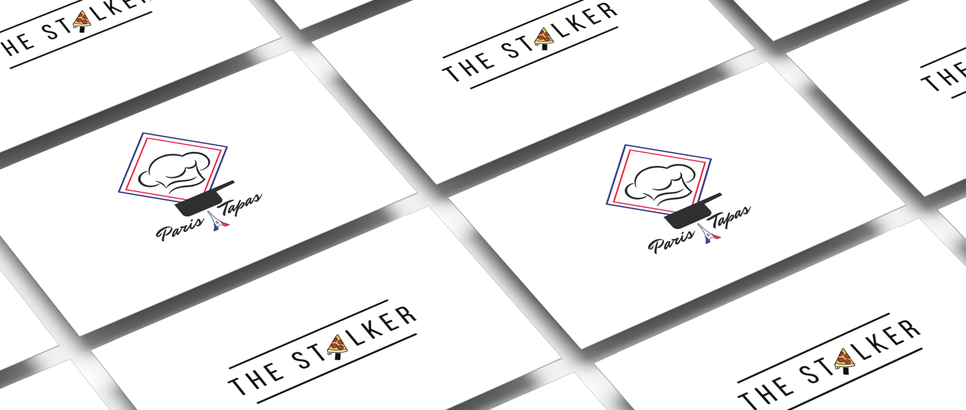
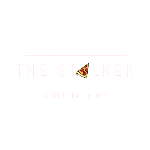
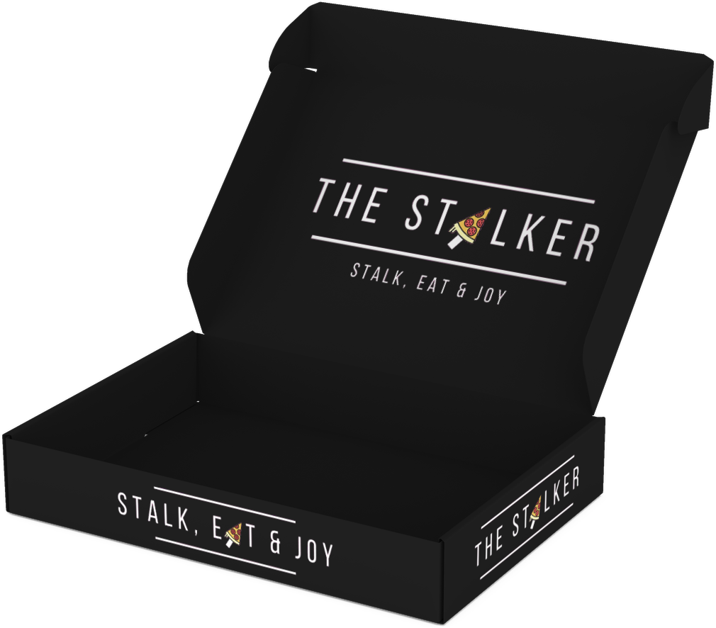
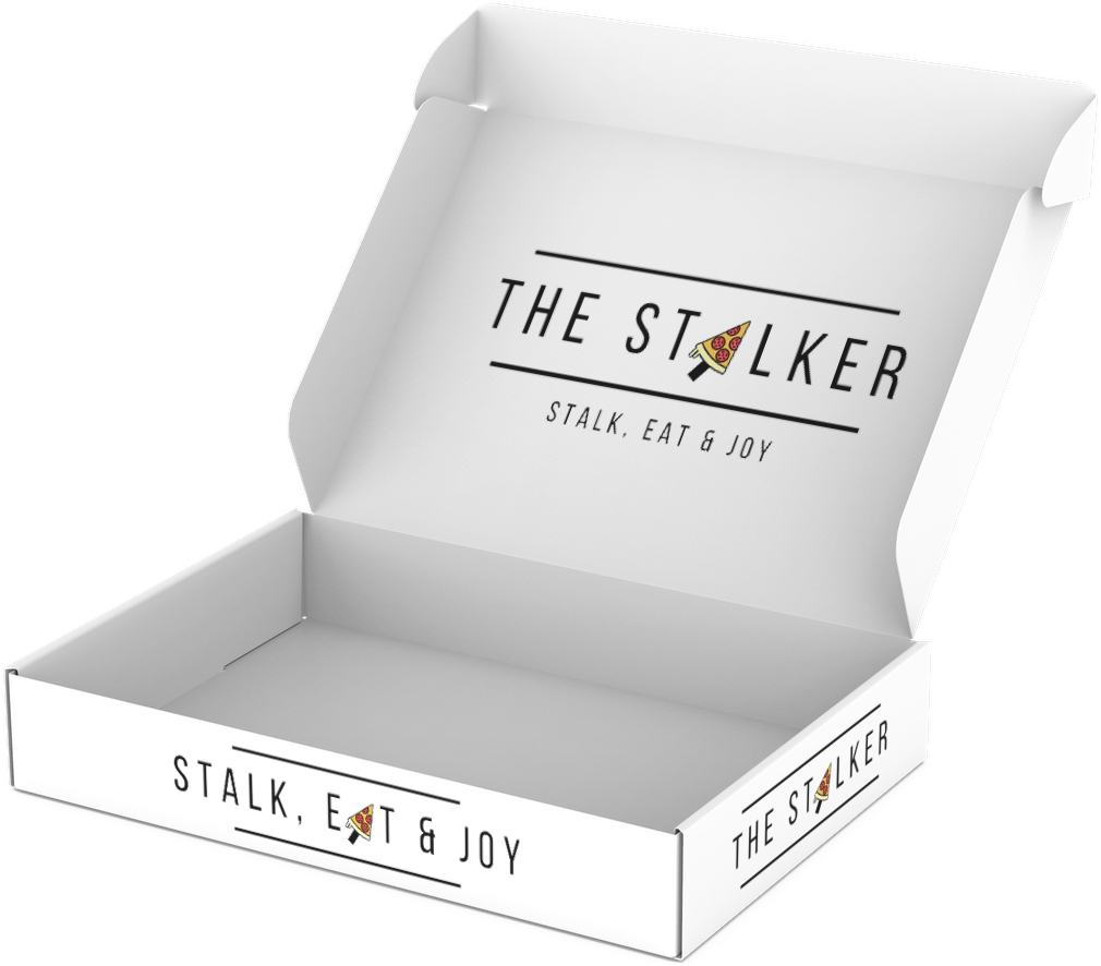
The Stalker
Made on Photoshop
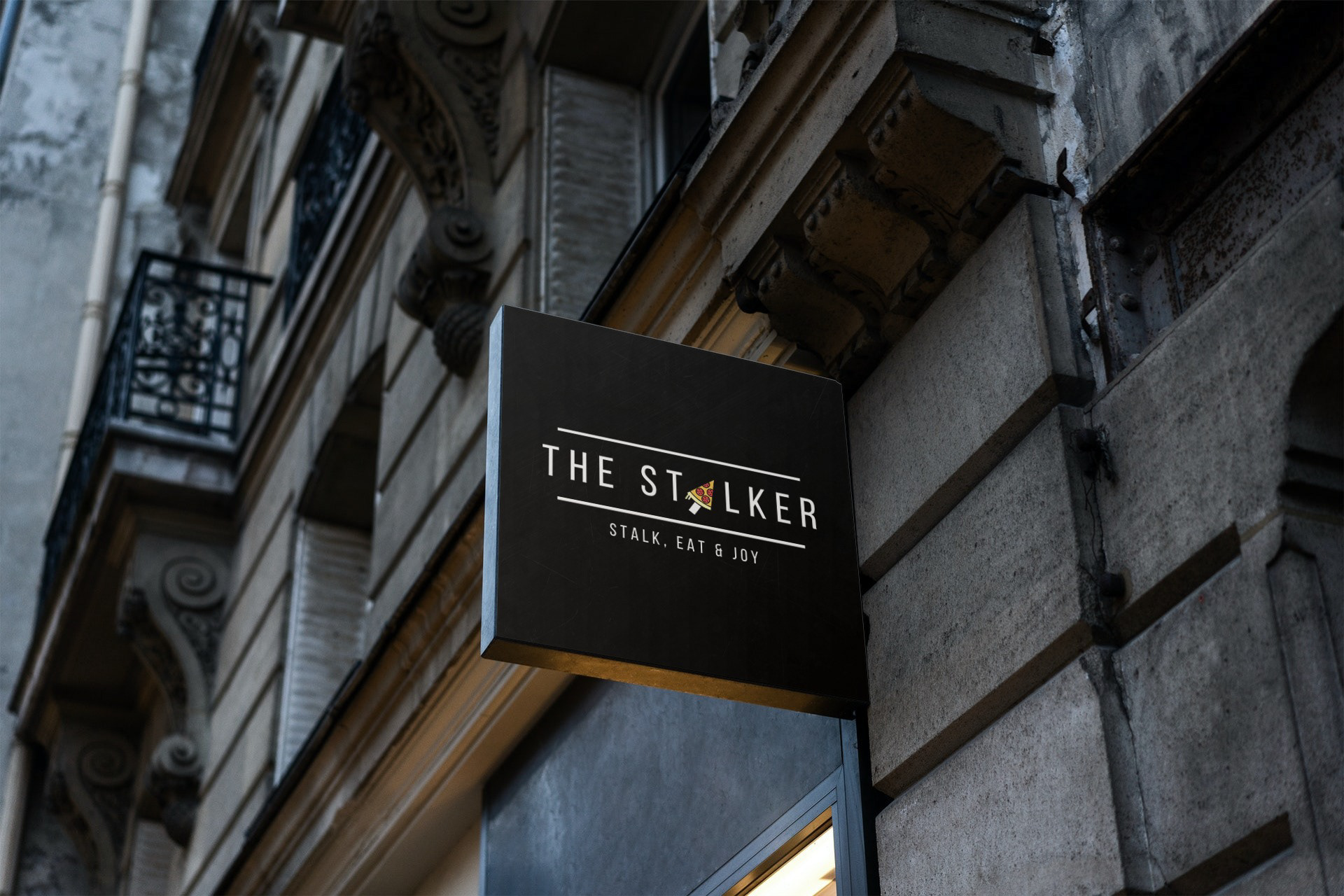
Since the first lockdown, the restaurant industry has been severely impacted by the health crisis, while streaming platforms have seen an explosion in viewership. This pizzeria, where "stalking" is encouraged, was born over a cold beer between two young slappers from Haute-Savoie. The concept is simple: give customers the opportunity to watch live as their pizzas fly through the kitchen during preparation.
The name The Stalker evokes a young and dynamic vibe. Additionally, its meaning aligns with the idea of watching your pizza being prepared from the comfort of your home. But it’s not just any preparation—they offer a real show by tossing the dough in the air. This concept guarantees quality, as customers can watch the process firsthand. Furthermore, the founders source their ingredients exclusively from local producers.
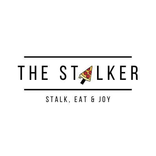
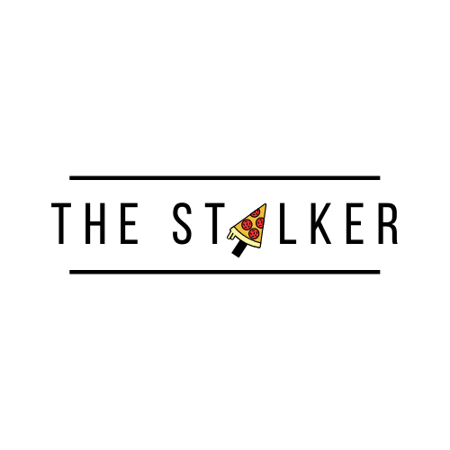
The logo for this new pizzeria was designed with a street-style vibe and a modern font. The "A" in Stalker is replaced by a pizza slice shaped like a computer mouse, symbolizing the click to watch the preparation video.
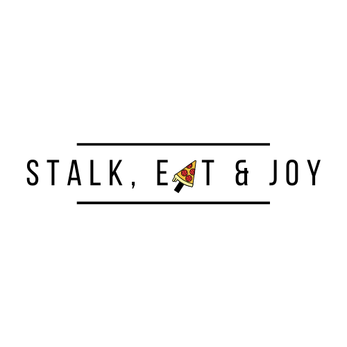
The slogan "Stalk, Eat and Joy" plays on the English word "enjoy," meaning to have fun or take pleasure.
Fait sur photoshop
Fait sur photoshop
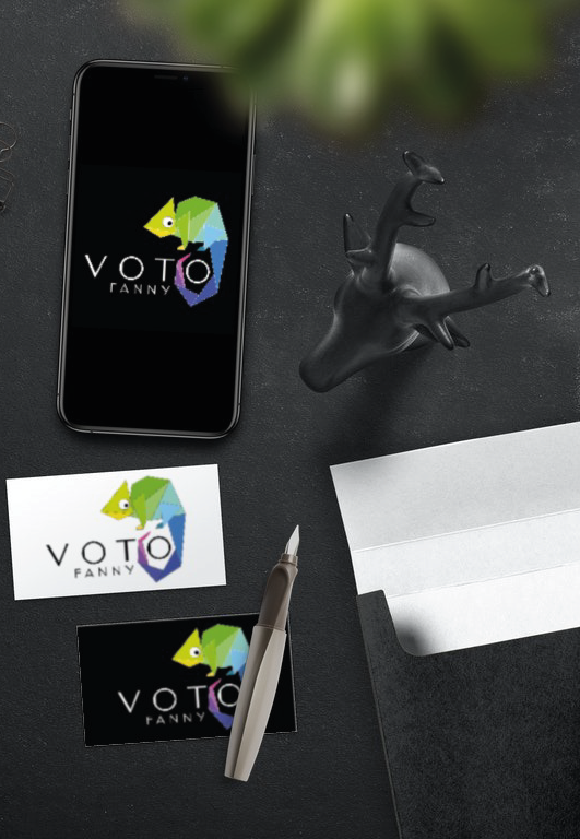
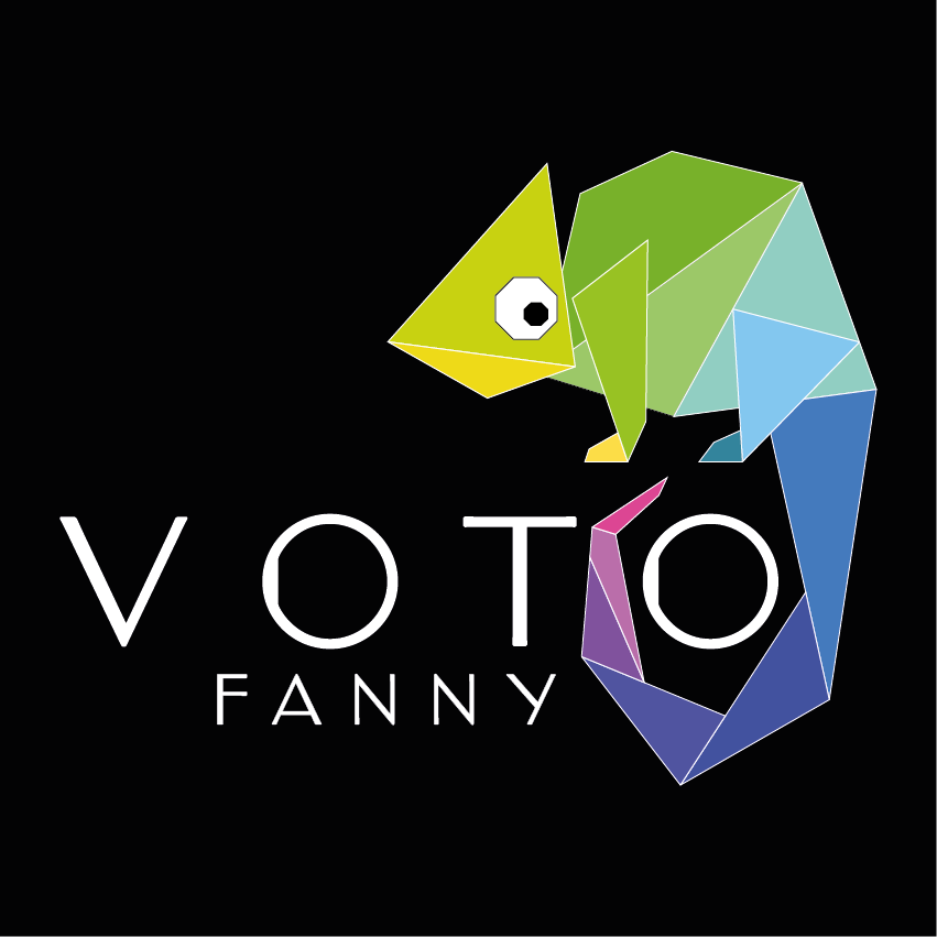
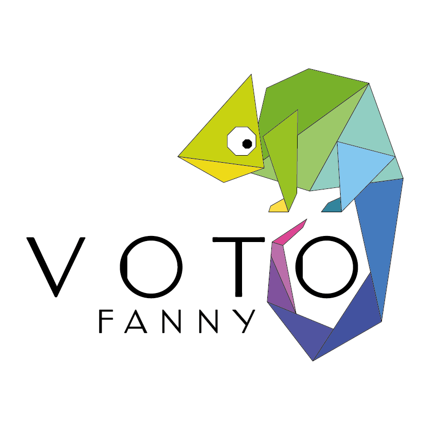
fanny Voto
Made on Photoshop
Made on Illustrator
Made on Illustrator
This logo was born from a school exercise. We were tasked with imagining and creating a logo that would represent us professionally. I chose to design a logo that is colorful yet simple to reflect my joyful and always enthusiastic personality, as well as my taste for clean, minimalist designs. I selected a chameleon because I enjoy working in various fields such as creation, brand strategy and communication, marketing, UX and UI design... My background has allowed me to explore all of these areas, making me versatile and giving me a holistic view of brands to help them grow. I am therefore able to understand their current operations, the environment in which they evolve, their expectations, and challenges in order to propose tailored solutions—just like a chameleon adapts to its environment.
Paris TApas
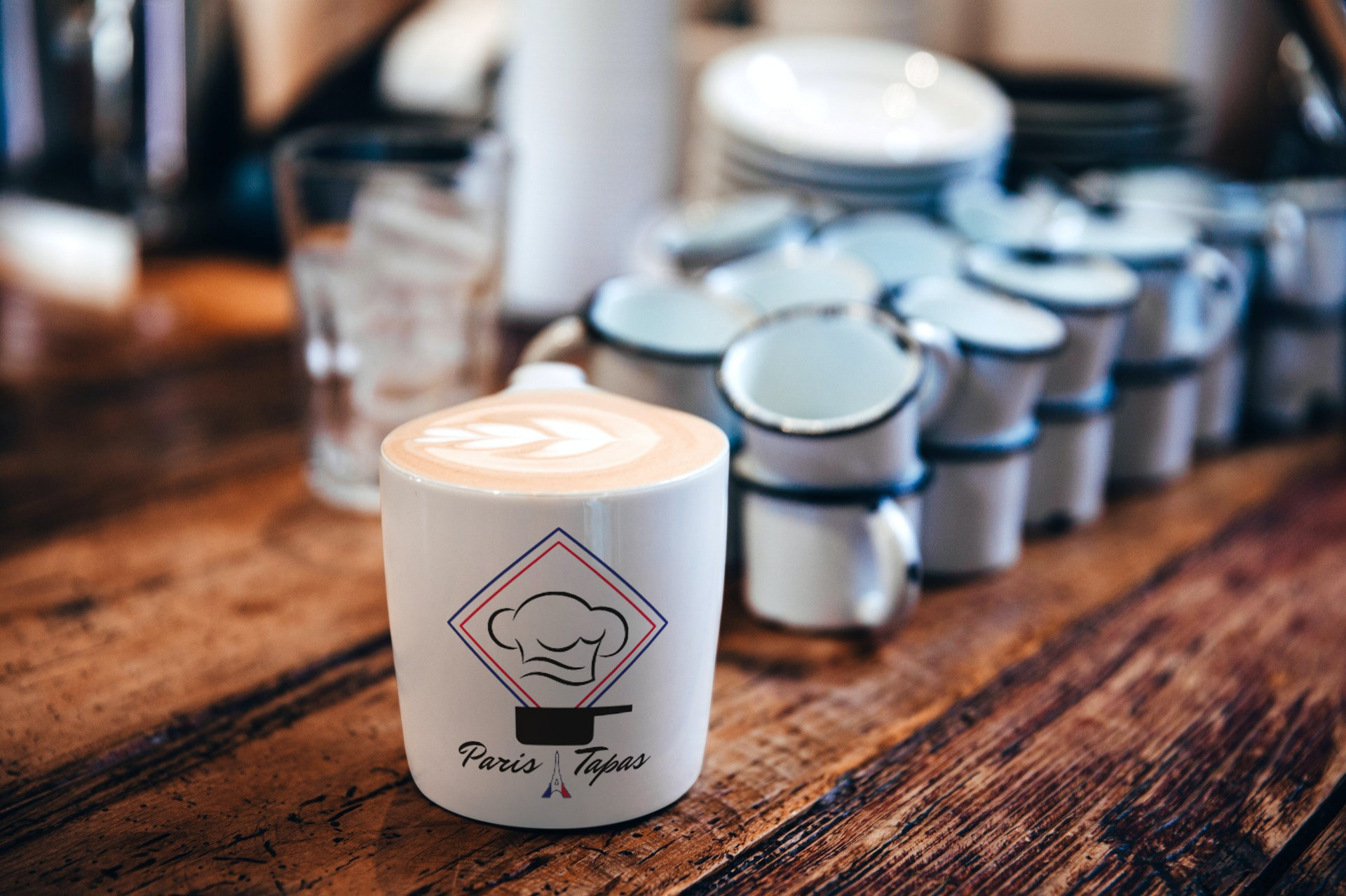
Tapas Nocturne is a tapas restaurant located in Paris. The owner wanted to open another establishment in Portugal. Therefore, we had to analyze the Portuguese market in order to best adapt the concept abroad. We discovered that the Portuguese have a strong affinity for French cuisine and that Lisbon is a cosmopolitan city, making it an ideal location for our tapas bar. We adapted the name, menu, brand identity, logo, and communication strategy to fit the new host country.
The goal was to maintain the image of French cuisine—gastronomic and refined, as it is often imagined by foreigners. This is why we chose the colors of the French tricolor flag, the Eiffel Tower, an international symbol of France, and a cooking pot to illustrate the restaurant’s activity, along with a chef's hat to evoke the gastronomic aspect. The hat also resembles smoke swirls rising from the pots. The font adds a sophisticated touch, representing Paris and France.