Fait sur Final Cut
Rossignol is an outdoor sports brand that is well-known and specialized in winter sports. The brand now aims to become a major player in outdoor activities across all seasons. As part of his strategy, it has begun developing products for trail running, hiking, and cycling. Its latest and most ambitious project is to enter the ultimate summer sport: surfing. Our team was tasked with conceptualizing the entire product launch from A to Z, including the creation of a surfboard, a communication campaign, market research, positioning, and brand identity.
Deliverables: market research, roduct strategy, product creation, brand identity, communication strategy, advertising campaign, and retro-planning.
Le logo
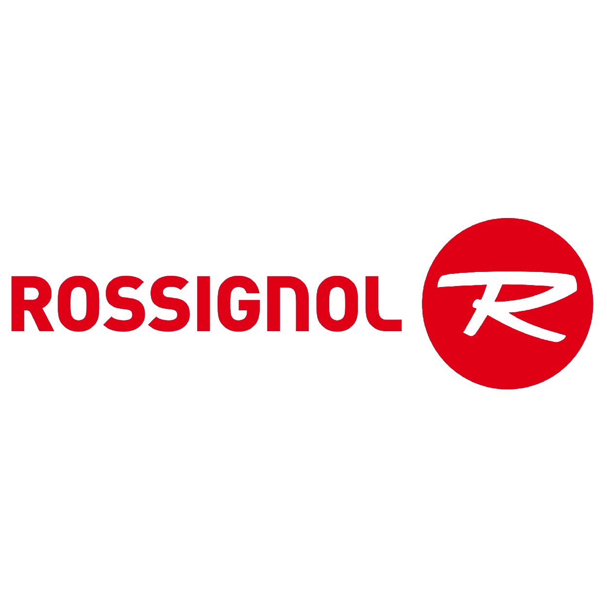

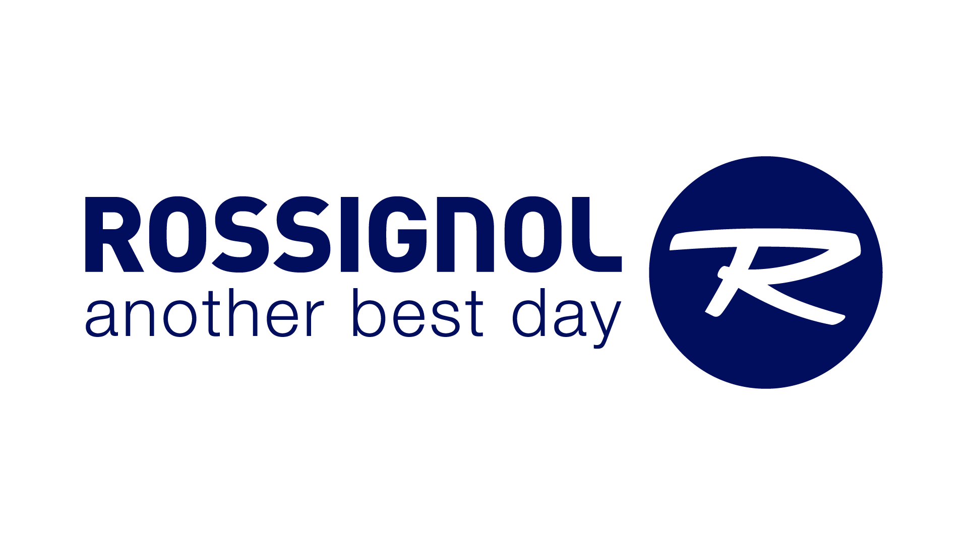
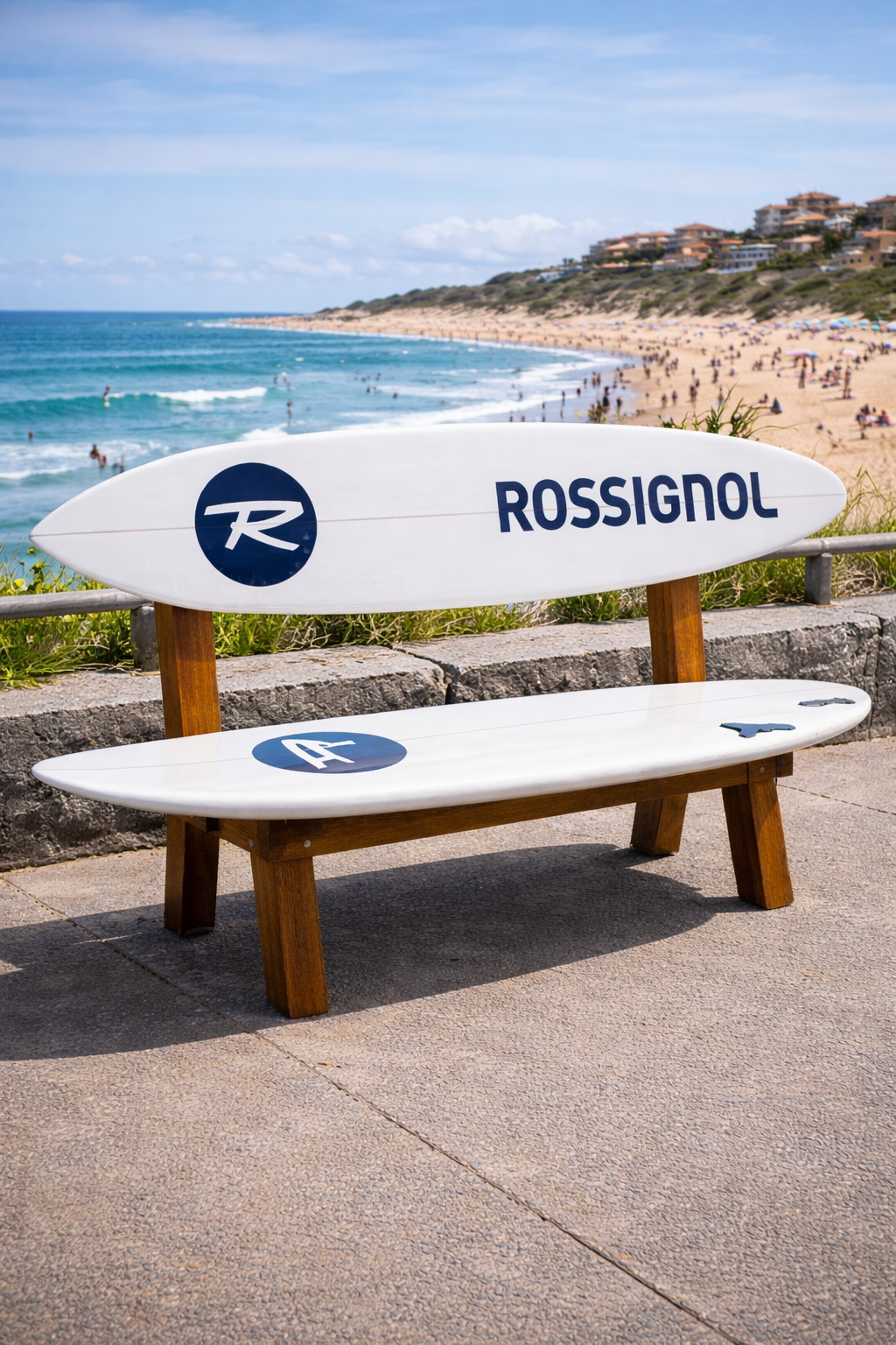
The Rossignol logo changed in 2020 to feature a rooster. Until last year, the brand was represented by an "R" inside a red circle, which was the case when the project was created. We chose to keep this logo. However, it will be dressed in blue for the development of the surfboards, symbolizing the color of water.

The Products
Following market analysis, as well as an evaluation of the Rossignol brand, its competitors, and their positioning, we developed the project in line with Rossignol's image: a professional brand, an expert in its field, promoting self-improvement, team spirit, and a passion for nature and sports.
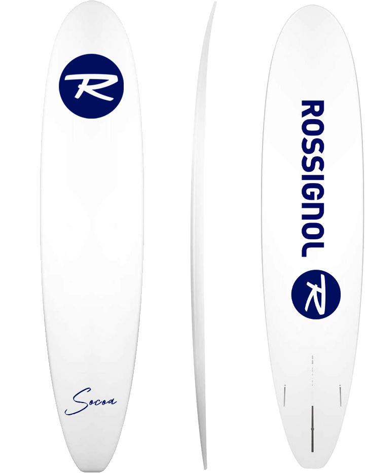
The first range of Rossignol surfboards had to include a product designed for professionals or experienced surfers. Similar to skis, there are different types of surfboards. The two main types are longboards, which offer stable performance on all types of waves, and shortboards, which provide better maneuverability for performing technical tricks and more aggressive surfing. Therefore, we chose to produce two boards catering to these two different practices. They will be designed in partnership with athletes who will not only contribute their expertise but also their visibility.
The Aérial
The Socoa
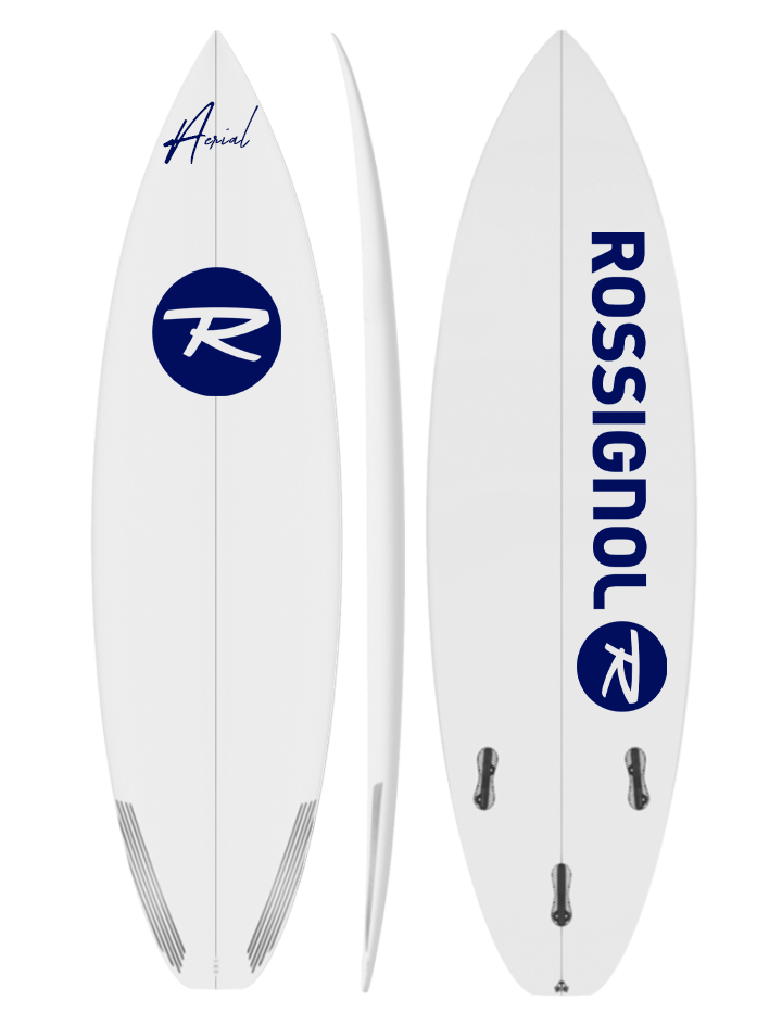
This shortboard is named Aérial. The term refers to complex aerial tricks that require a certain level of skill. The name thus evokes professionalism, maneuverability, and also the sense of freedom that surfing provides.
Socoa Beach is a surf spot particularly appreciated by longboarders. Additionally, the name carries Hawaiian connotations, reflecting the birthplace of surfing, which is why we chose to name this board the Socoa.
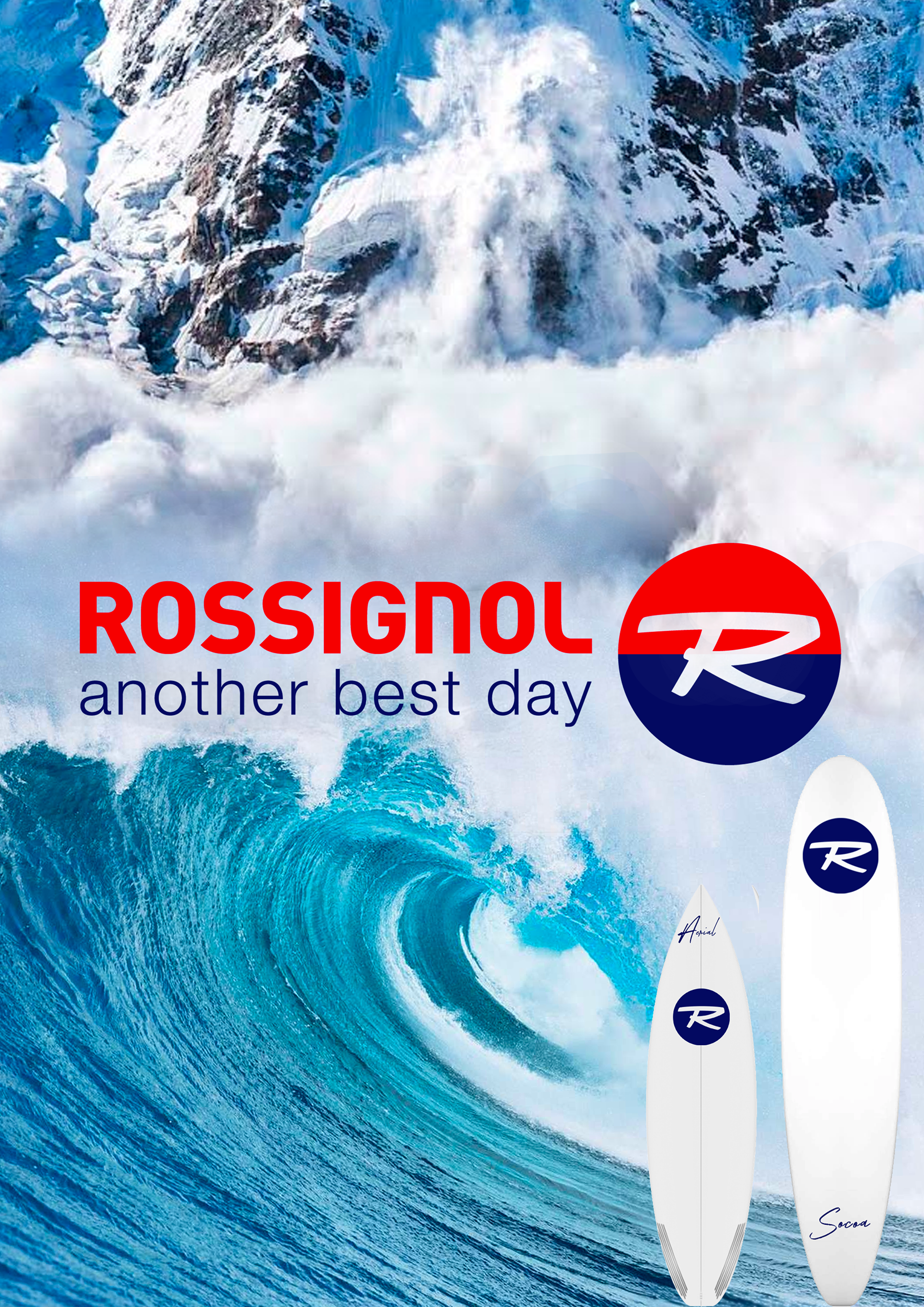
Poster
Fait sur Photoshop
Fait sur Photoshop
This poster clearly illustrates the transition between winter, with an avalanche, and summer, with a barrel (a wave that forms a tube in which surfers ride). The logo has also been split—red on the winter side and blue on the summer side. We chose not to feature skis on this poster, but only the two surfboards to highlight them as much as possible. Indeed, the purpose of this poster is to introduce the two new products to consumers, rather than to promote the existing winter collections.